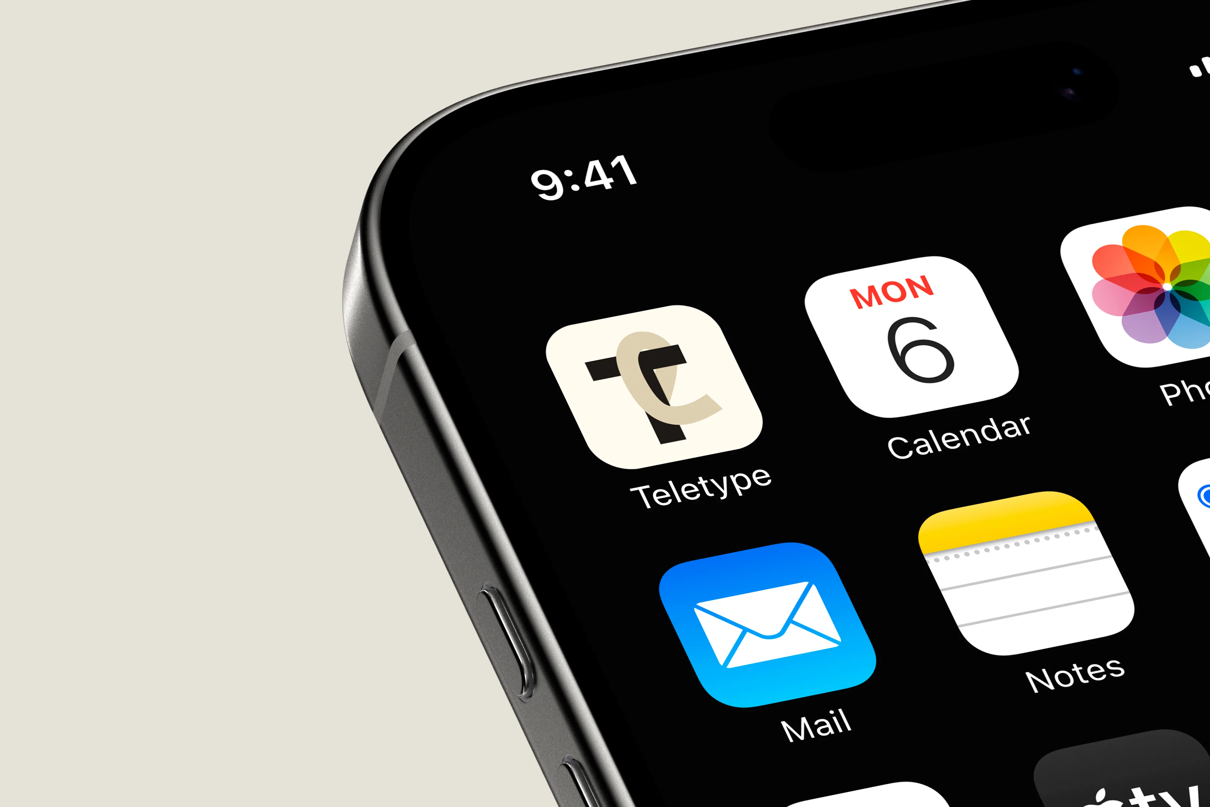
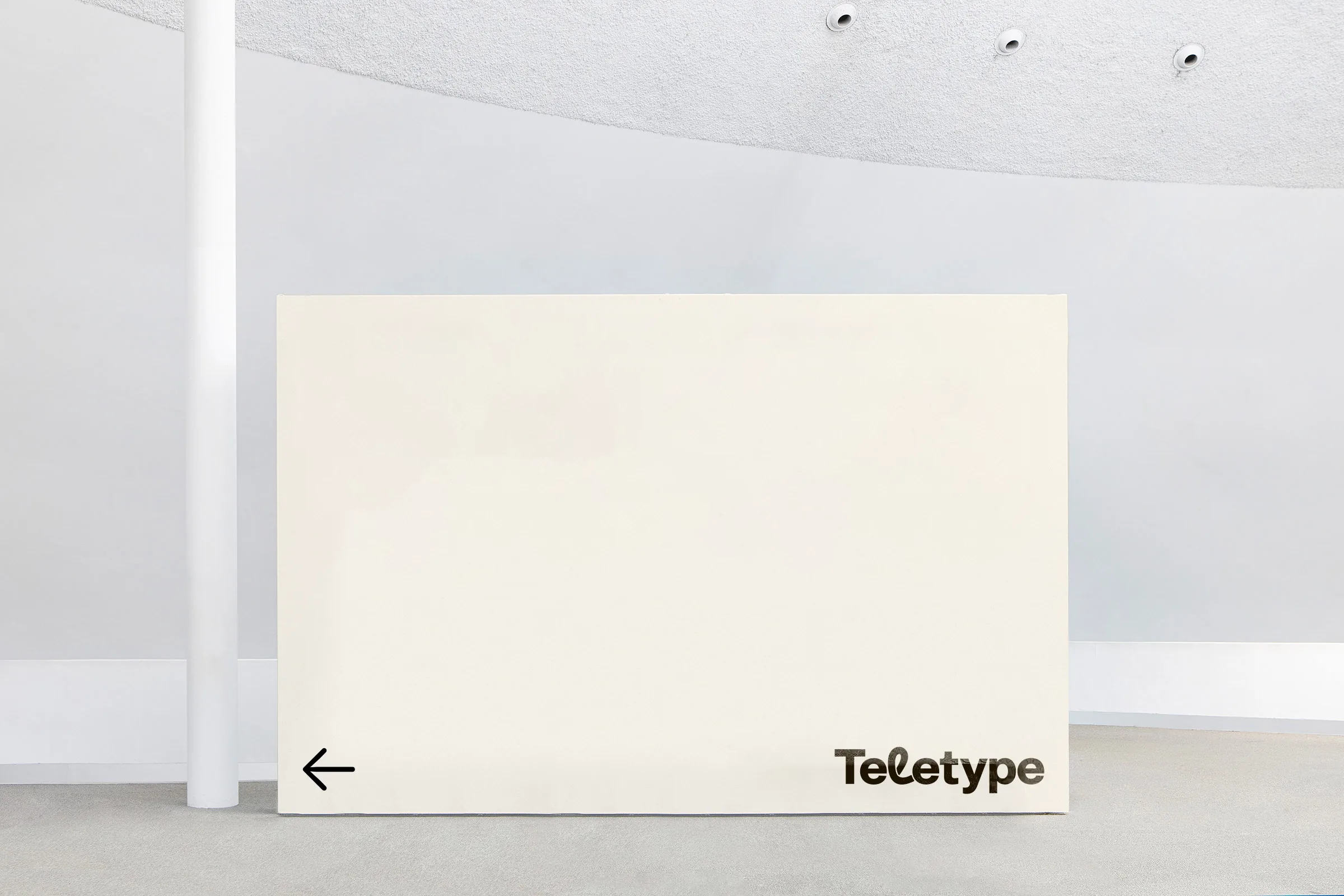
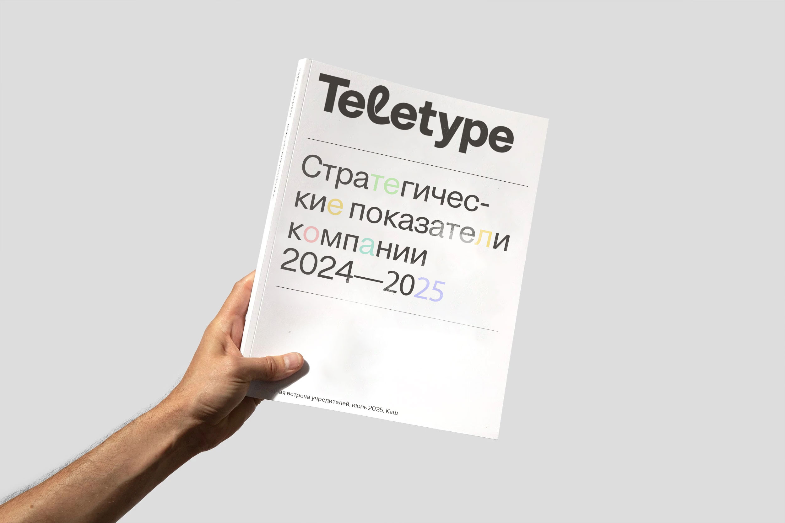
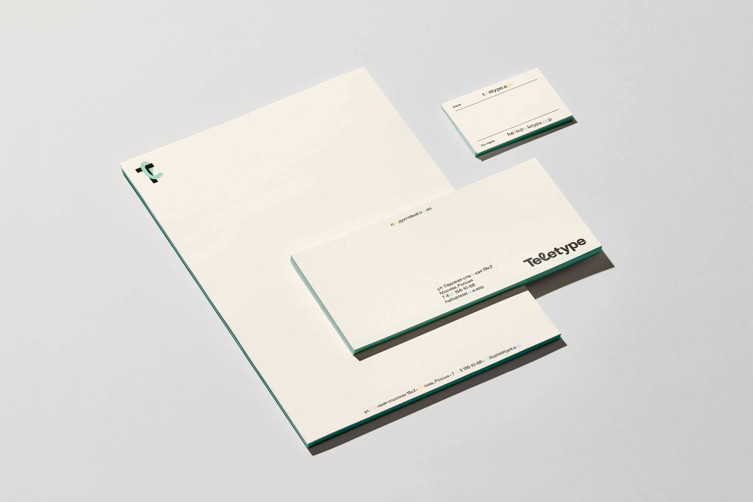
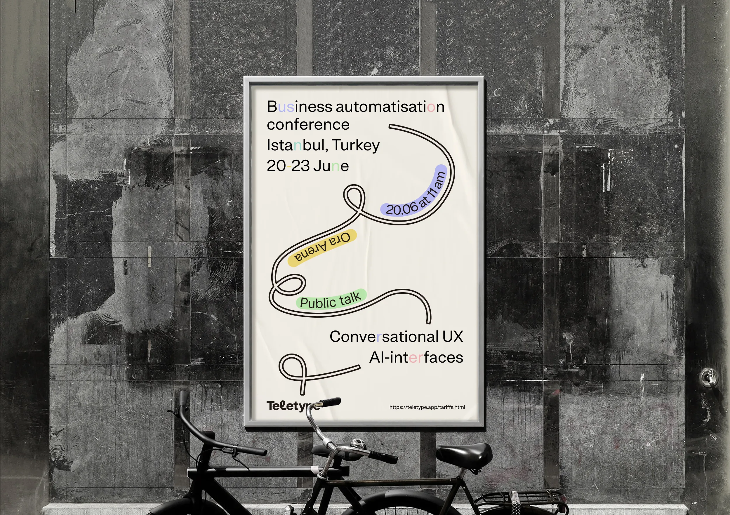
Teletype
Brief and problem statement
Teletype approached us to refresh their visual style. We started with the brief: the product, its audience, strengths and weaknesses. Functionally, the service was strong, but its communication lacked clarity and cohesion.
The challenge: position Teletype as a cloud service for customer communication and differentiate from competitors.


Positioning
Analyzed 20+ competitors: from Intercom and Zendesk to Jivo and Carrot Quest. Found the niche: a cloud service with AI for customer communication.
Built a persona: online store owner, 12-person team, losing leads across scattered chats. Wants everything in one window. Doesn't want to hire a developer.
Values
We defined three core values:
- Always be in touch
- High enterprise standards
- Care for the person at every touchpoint
Tone of voice
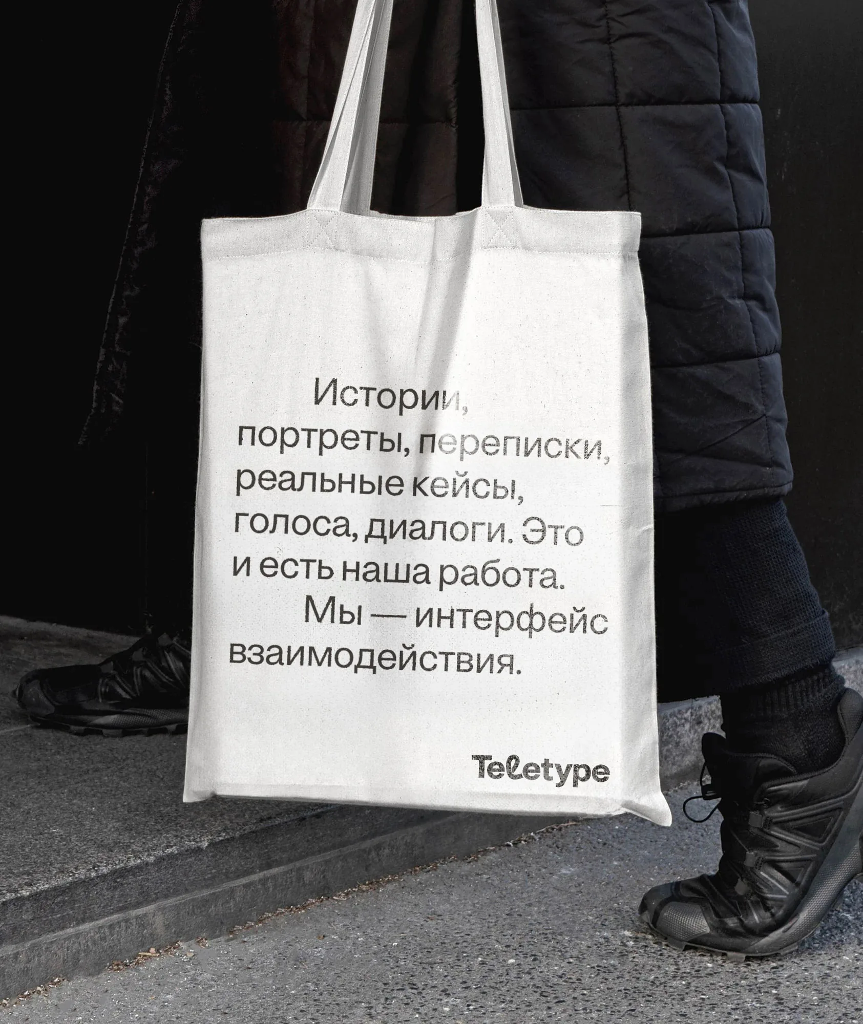
Confident, calm, avoiding tech jargon, speaking human to human.
Before: “Aggregator of messengers and social networks.” After: “Teletype — cloud dialog center for business.”
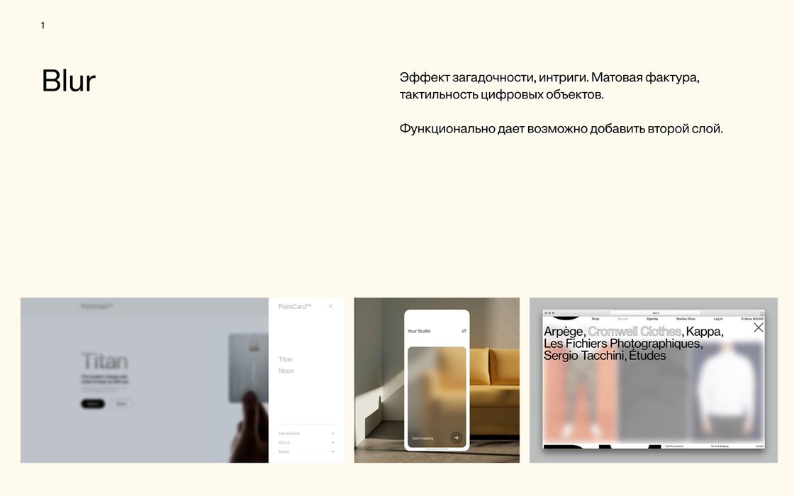
Visual concepts
Developed three visual directions. Each reflected a different brand character: from brutal telegraphic style to soft corporate.


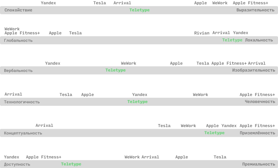
Brand attribute scales
Graphic techniques


Audience and archetype
Defined the brand archetype — Magician + Caregiver — and built the target audience portrait. This became the foundation for tone, visual language, and communication structure.


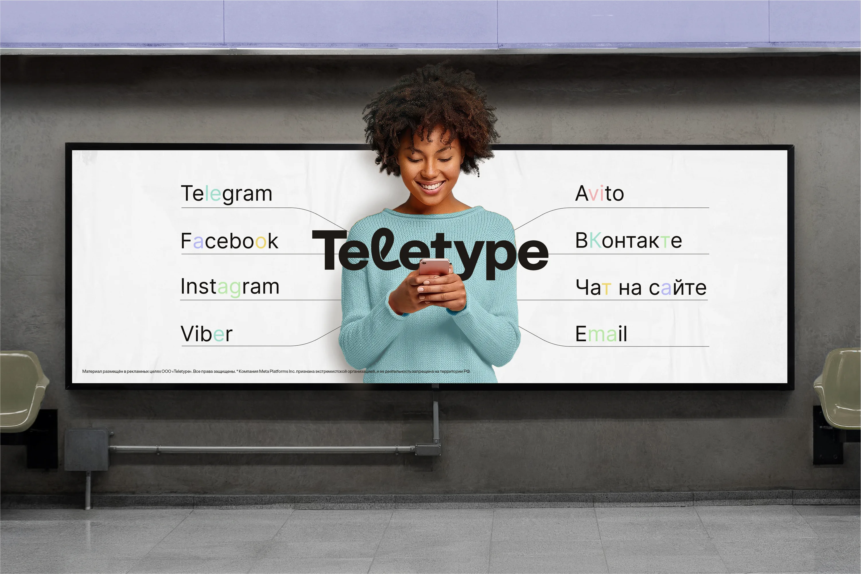
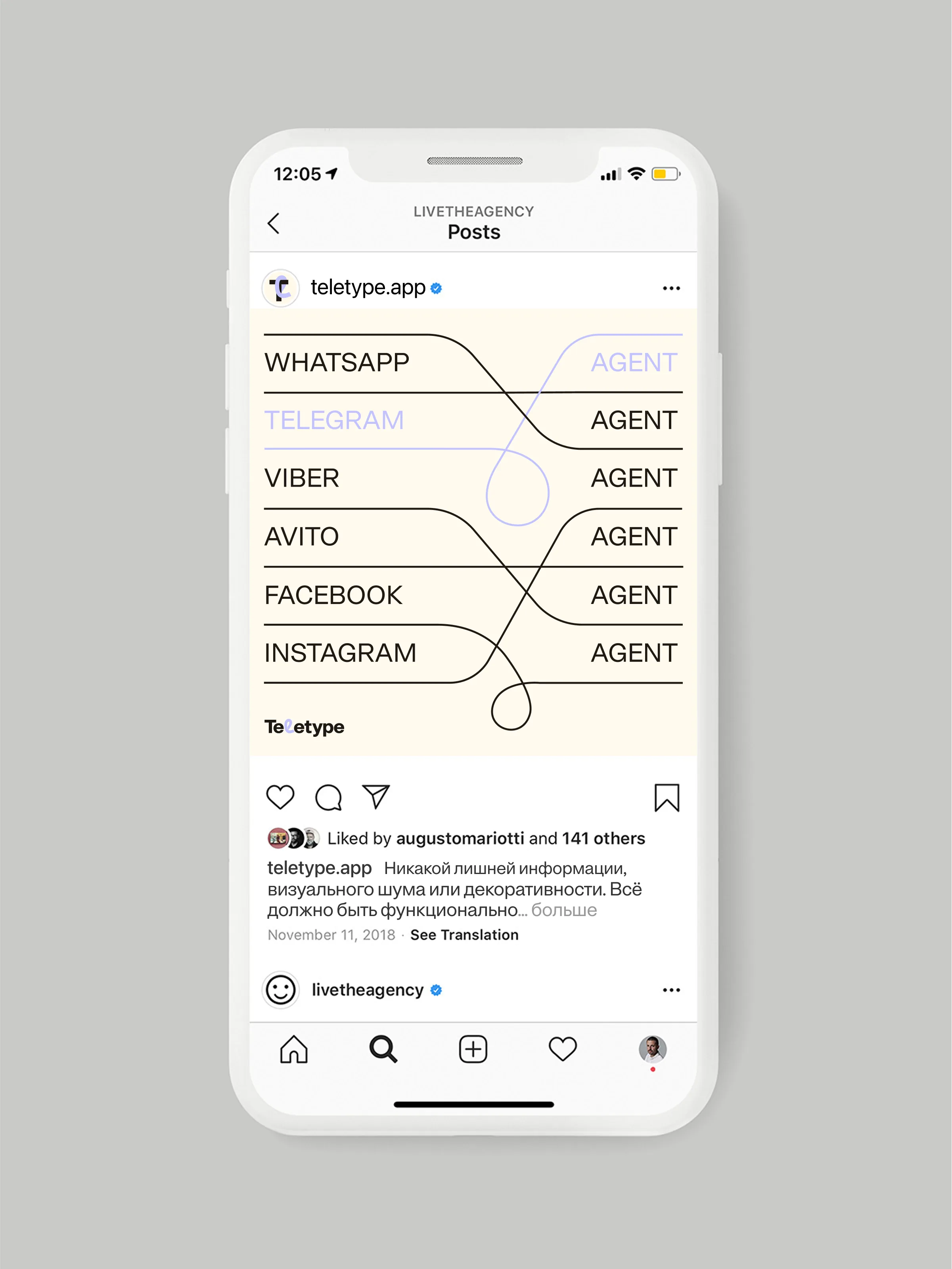
Teletype is a cloud dialog center for business. The service brings together messengers, social networks, email and website chat in one window, merges scattered inquiries into a unified communication history, connects AI agents, adds analytics, integrations and marketing tools.
abcdefghijklmnopqrstuvwxyz
0123456789
!@#$%^&*( ).
Context
After the identity update, the old landing page no longer matched the new positioning. The visual language was outdated and the structure didn't reflect the product's key strengths.
Challenge
Design a new landing page that:
- Communicates the updated positioning: cloud dialog center with AI
- Conveys product value in the first seconds
- Shows the interface in action
- Drives sign-ups
Solution
The landing page follows the logic: problem → product → how it works → who it's for → result. Visually — the new brand style, interface animations, clean typography. Minimal text, maximum clarity.

Iterations
We explored 12+ landing concepts: from structure and messaging to visual language.


Result
The landing page launched alongside the updated brand.