
Skysmart
Three roles — one product
Every feature was tested: does it work for the student, the teacher, and the parent?
Student — progress, El onboarding, quests and achievements. The interface motivates without pressure.
Teacher — student survey and goals before the lesson. Push reminders. Content recommendations based on the health system.
Parent — monthly PDF progress reports. Data to support subscription renewal decisions.
The same entity behaves differently. El is eight when talking to kids. Twenty-eight when talking to parents. Dashboard, progress, and reports — one system, three entry points.


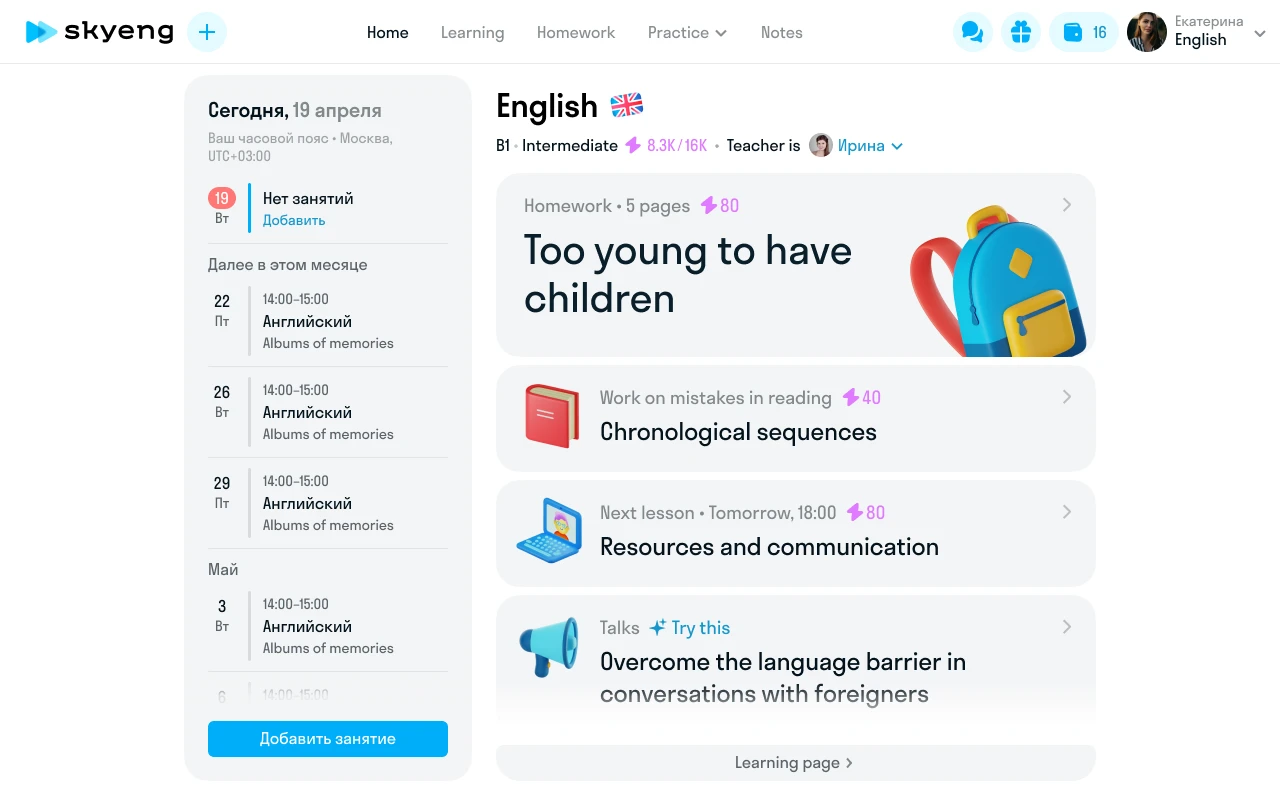
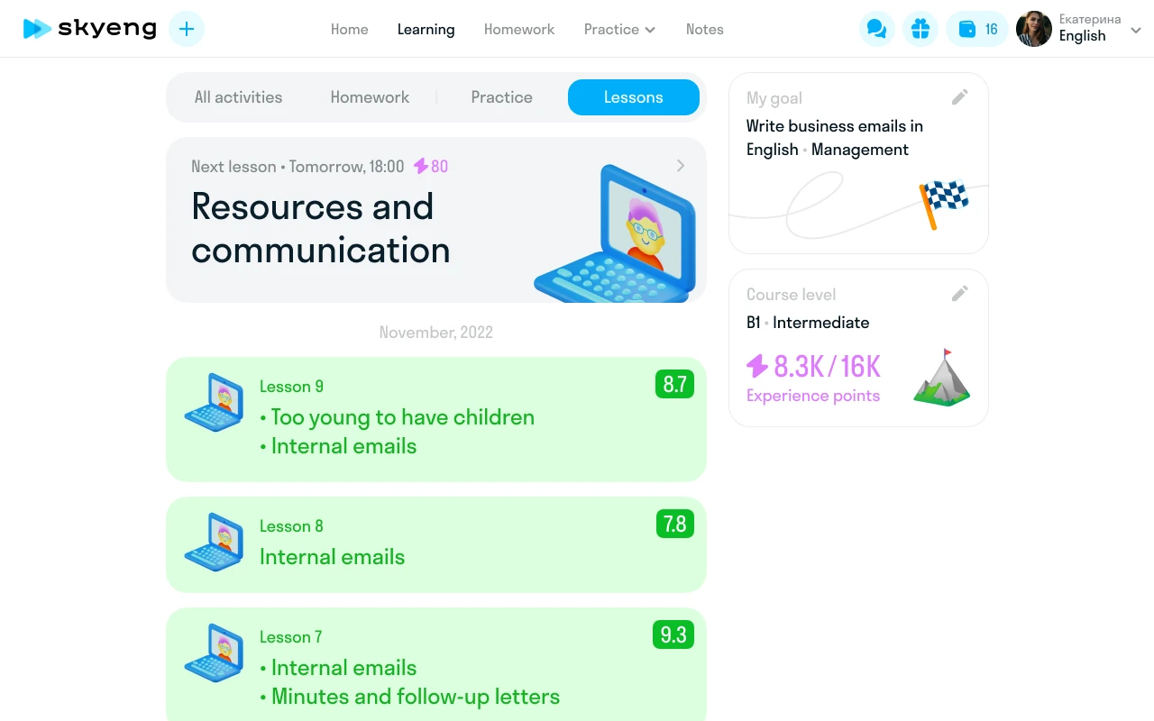
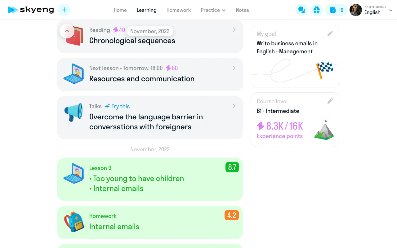
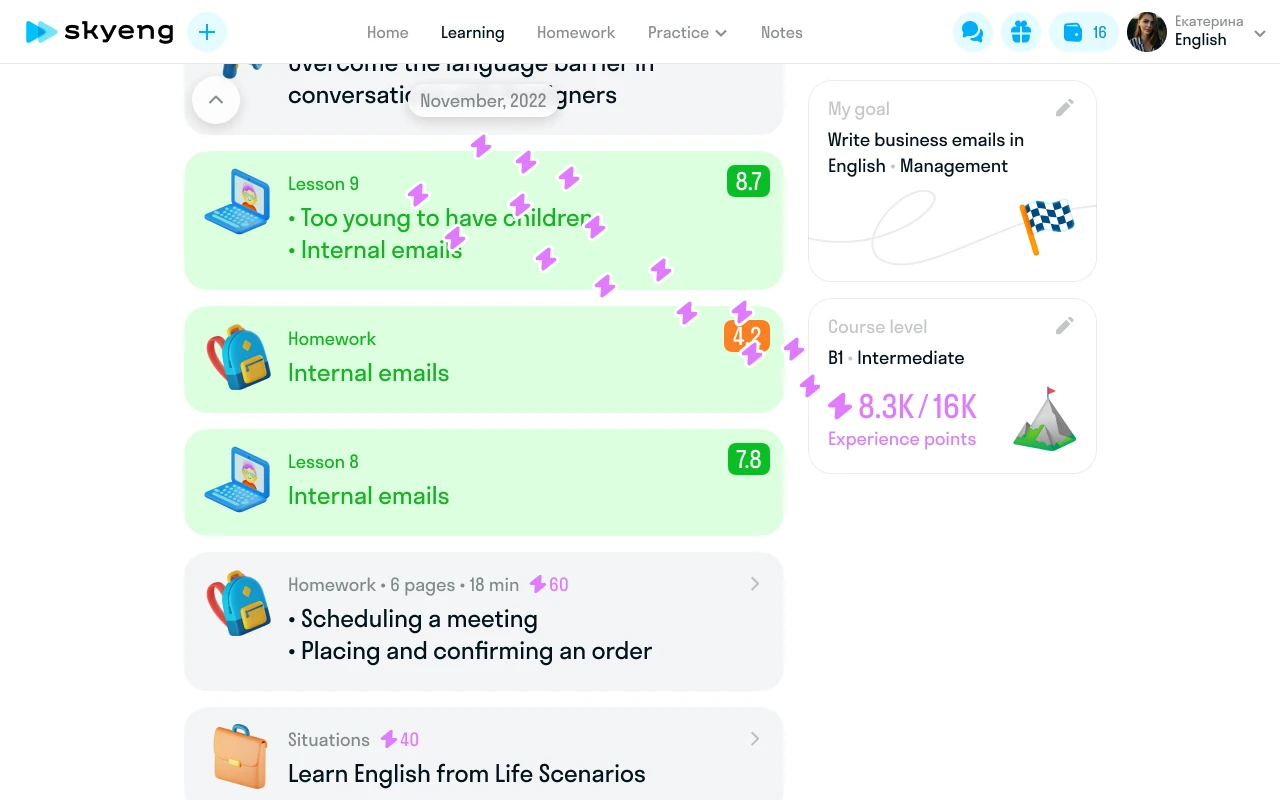
Student dashboard
Skysmart is the K-12 product of Skyeng, Russia's largest online school. Three learning models: one-on-one tutoring, group sessions, self-paced exercises. Students range from 4 to 18.
No unified dashboard. Each subject had its own interface. Students switched between separate apps. Schedule, tasks, and progress lived in different places.
Design a unified dashboard for all formats and subjects. My role: UX research, interaction design, visual design. Team: PM, two developers, methodologist.

Outcome
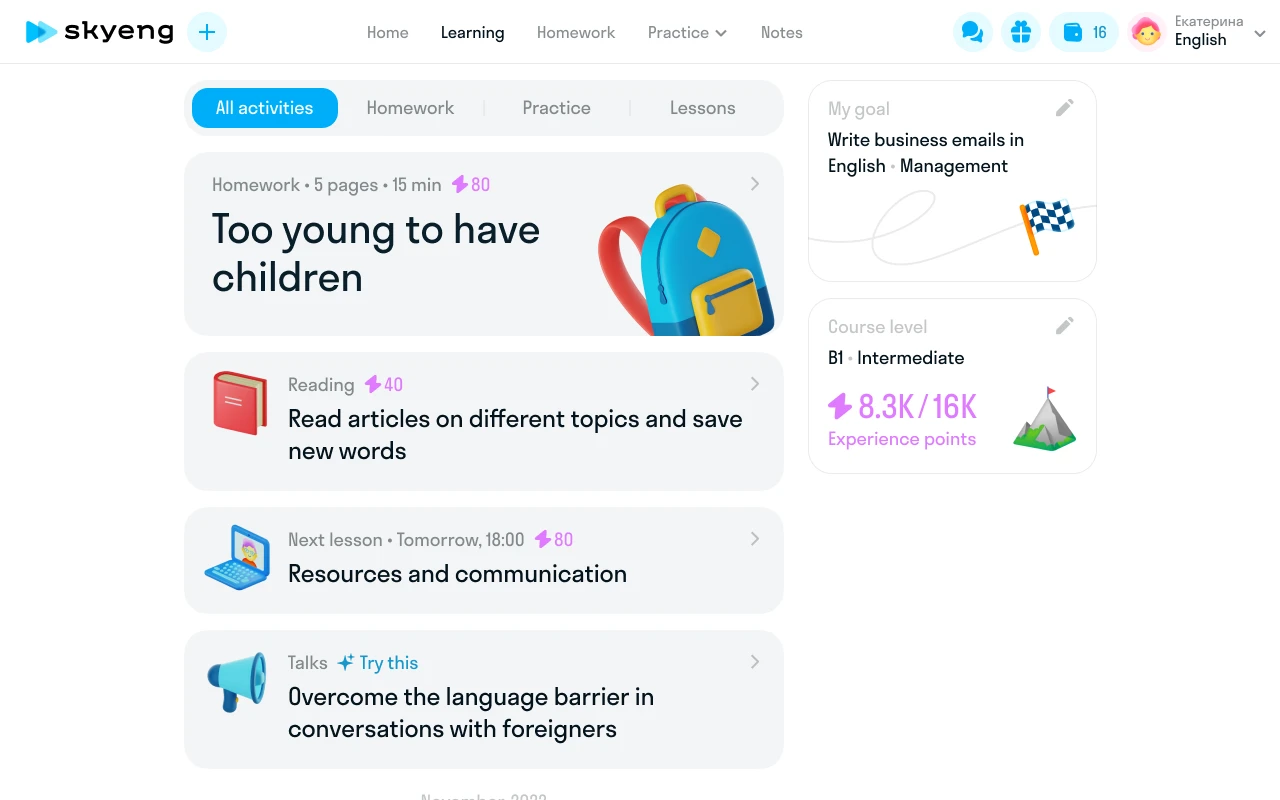
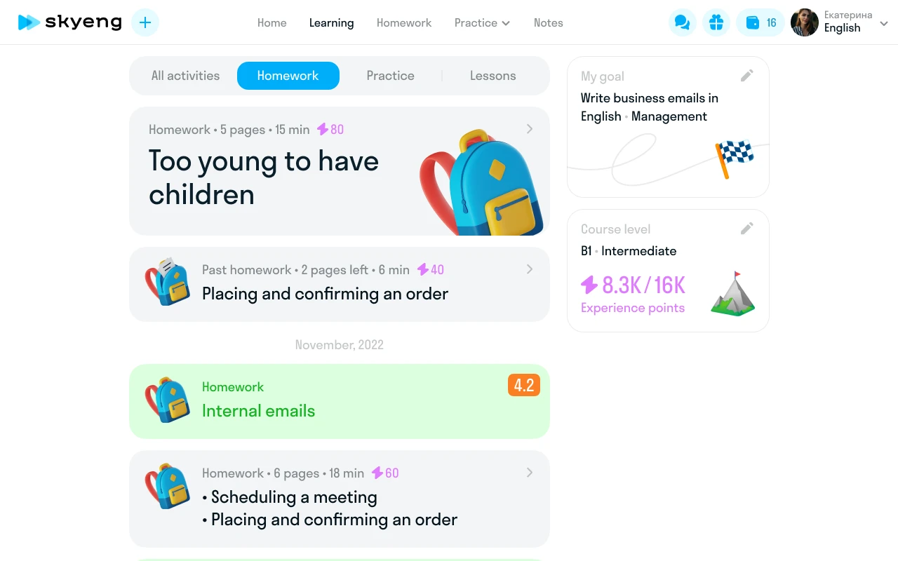
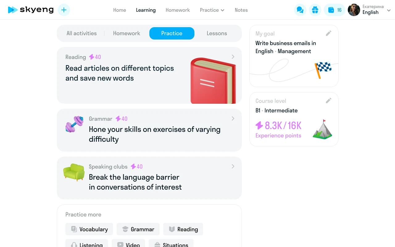
Seven iterations. Each tested a hypothesis: chronology, scenario, categories, goals, cards, minimal. The final version took the best of each approach. Unified dashboard launched for all Skysmart students. Three learning models — one interface. Students see tasks, schedule, and progress on a single screen.
Goals from the landing page application never reached the product. Teachers started lessons blind — didn't know why the student was learning, their level, or what was hardest. In automated scenarios, all context was lost.
Connect student motivation to course content. Build a path from application to first lesson where no goal gets lost. My role: system design — CJM, survey, integration with the teacher dashboard.
"I used to start lessons blind — didn't know why the student was learning" — English teacher
The system
Two entry points: demo lesson with a methodologist or directly after payment. Path: dashboard → survey → profile → screening → first lesson. Eight fields: goal, deadline, current position, motivation, desired level, hardest part, study habits, interests. Screening results feed back automatically. If the student edits goals during the first lesson — data updates.

First lesson
A separate design project. Six questions (goal, sub-goal, level, timeline, position, difficulties) become a plan for the first lesson. The teacher sees answers before the session starts and builds the lesson around student goals. If the student didn't fill the survey — Telegram push, SMS with a link.

Subject-specific diagnostics
Kids English — playful questions with illustrations. Math — level assessment tasks. Adult English — self-evaluation with 40+ goals and 50+ interests. One system, three different experiences.


Outcome
Before this system, goal data wasn't collected at all — zero. Teachers got context before lessons. Goals from the application became part of the product.

Progress and gamification
Progress wasn't visualized anywhere. Not for the student, not for the teacher, not for the parent. The only metric was "completed 5 of 20 lessons."
Visualize progress so the student feels movement, the teacher gets data for content adaptation, and the parent sees reasons to renew. My role: research, concepts, final design of the health system and gamification.
Eight concepts
Each solved the problem differently. None worked for all three roles simultaneously:
- Completion percentage — clear, but no mid-course motivation
- Linear progress — boring for long courses
- Skill categories — too abstract for kids under 10
- Timeline — works for adults, not children
- Level map — too game-like for parents
- Checklists — motivate task completion, but don't show growth
- Charts — informative, but not emotional
- Health system — composite assessment. This one worked
"I love checking things off like in The Sims" — from an interview with a 14-year-old student
Health system
The final model: composite assessment across five skills — reading, listening, grammar, speaking, writing. Each skill with percentage and trend. The teacher sees the same picture and gets content recommendations. Parents receive PDF reports.


"I can finally see what my child learned this month" — a student's parent
Gamification
For kids — quests with timers and rewards. Stars accumulate toward puzzles, coloring pages, diplomas, game access. Explored Battle Pass, Spotify Wrapped, collectibles. Took from each: time pressure (Battle Pass), retrospective (Wrapped), visual progress (collections). Dropped: competition between students — wrong for education.
Competitors: Duolingo (streaks), LinguaLeo (lion hunger), Busuu (XP), Foxford (achievements). Their patterns shaped the foundation of the reward system.

Streaks and XP
Alongside quests, designed a streak system. Model — Duolingo: consecutive day counter, freezes, experience points. "24 days in a row. 2 freezes left. You can skip 2 more days without losing your streak." Onboarding — three tooltips: course map, progress flag, XP lightning bolt. Each explains one entity. Decision: streaks motivate without pressure. Missed a day — not punishment, just a gentle nudge.
Goal widget
Cycles through four states: no goal set, survey partially done, goal selected, new map activities. Each state has its own design with CTA and feedback.


Outcome
Health system launched for all students. Teachers got content recommendations based on data. Parents got PDF progress reports. Three roles see one product — each sees their own version of the truth.
The interface was standard — no visual identity, no mascots, nothing kids would want to collect. Generic educational UI.
Create a visual language kids would want to collect: mascots, badges, rewards, stickers. My role: concept, criteria, art direction. 3D modeling — a dedicated specialist.
Mascots
Three mascots accompany students. Each has its own personality and pose set: success, error, waiting, congratulations. The main one is El. Eight years old when talking to kids. Twenty-eight when talking to parents. Same character — two ages, two manners, two tones of voice.
"El is 8 when with kids; 28 when with parents"

El's personality
Seven recommendation states, each with a unique tone:
- "Not great, but don't give up!" — weak results, encouragement
- "Easy! You're studying great!" — all good, reinforcement
- "Come back after your first lesson" — new student
- "Good! Keep growing" — steady progress
For parents — different register: "Max did well, studied very well this month." Same character, but adult tone, formal vocabulary, data focus. 200+ frame-by-frame animation keyframes: joy, sadness, waiting, congratulation. Each emotion — a separate sequence.

Nine criteria
Defined requirements for 3D objects so the modeling team could work within a unified system:
- Recognizable at small sizes
- Readable without labels
- One object — one emotion
- Palette compatibility
- Works on white and colored backgrounds
- Stylistic unity with mascots
- No fine details
- Print-ready
- Series scalability
The reference for the team: "Imagine how this would look in Pixar or Animal Crossing."
Finding the metaphor
Before drawing badges, explored seven progression directions:
- Aging — from infant to enlightened sage. Clear, but too literal
- Animated object — from pathetic pigeon to general pigeon. Funny, but not serious
- Vehicle — from scooter to rocket. Works visually, unrelated to language
- Primitive symbols — stars, gems, elements. Universal, but generic
- Abstract heraldry — coats of arms and shields. Beautiful, but feels militaristic
- Artifact cups — trophies and awards. Competitive, wrong for education
- Flower — from sprout to bloom. Organic, but hard to scale to 6 levels
Anti-patterns: no militarism (swords, shields, epaulettes), no aggressive connotations. Explored British symbolism: bear, umbrella, teapot, double-decker bus. Outcome: simple hexagonal badges with progression through material and decoration.
Level badges
The course map visualizes the path through 3D badges. Levels from A1 to C2. Starter — simple orange hexagons. Mid-tier — with wings. Top — gold with a crown. Locked — gray, as a landmark and motivation.
"I want to collect all the badges up to gold" — 11-year-old student


Outcome
The 3D system became Skysmart's visual identity. Mascots, badges, and stickers are used across the interface, marketing, and student communications. A unified visual language instead of stock illustrations.